Design Process
01.
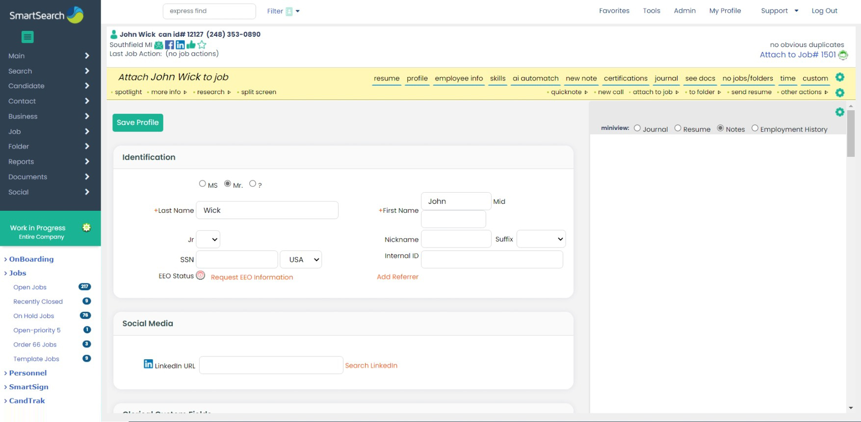
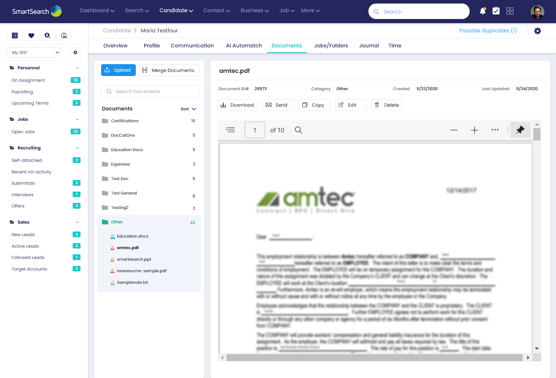
Old User Interface – Before Redesign
The Challenge
SmartSearch, a global CRM/ATS and staffing management software, helps organizations recruit, onboard, and manage top talent. However, the platform's existing UI was outdated, cluttered, non-responsive, and failed to meet the evolving needs of recruiters and staffing professionals.
- Complex navigation and overwhelming layouts
- Ineffective candidate search with outdated filters
- Difficulty attaching candidates to jobs quickly
- No mobile support for on-the-go actions
- Low engagement due to poor UX flow and visual hierarchy
02.
Research & Discovery
I began with a deep audit of the existing system, followed by:
- User interviews with recruiters and hiring managers
- Heuristic evaluation of the interface for usability issues
- Competitor benchmarking (Bullhorn, Greenhouse, iCIMS)
- Mapping key recruiter pain points and workflow blockers
Top insights uncovered:
- Too many clicks to access candidate/job data
- No visibility into task statuses or job progress
- Lack of clear hierarchy made it hard to focus
- Recruiters wanted quick-view summaries and actionable items
03.
Ideation & UX Strategy
I mapped new journeys and proposed experience-driven solutions:
- Streamlined workflows with fewer clicks
- Quick action buttons to reduce task time
- Redesigned filters and intuitive search with smart suggestions
- Responsive layout for mobile and tablet compatibility
- A modular card layout and accordion sections for data-heavy screens
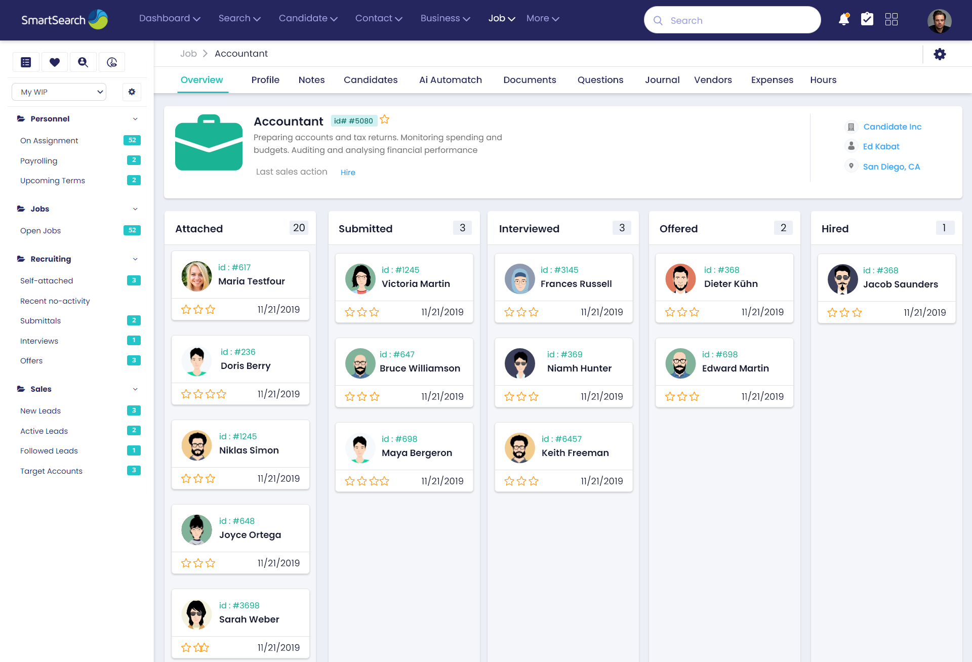
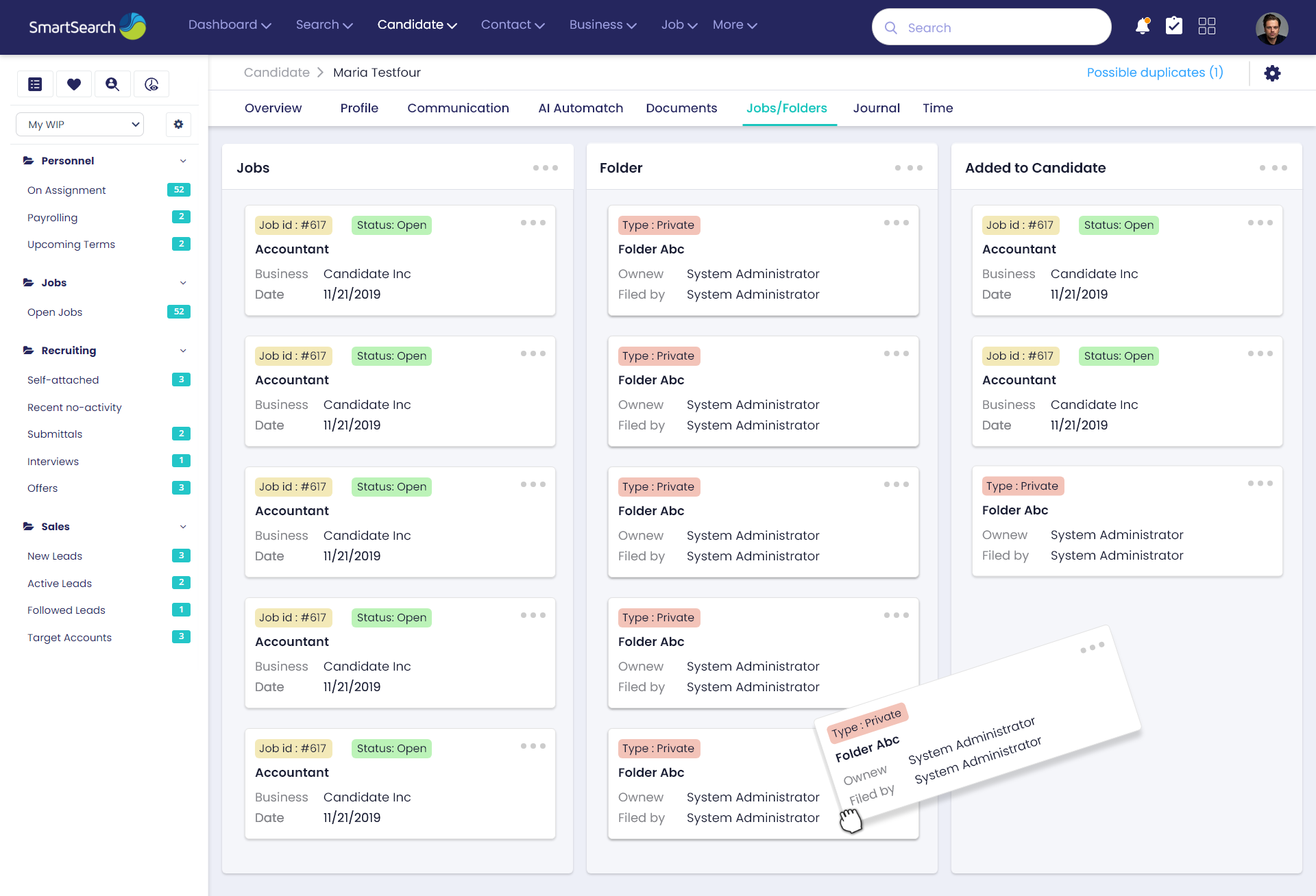
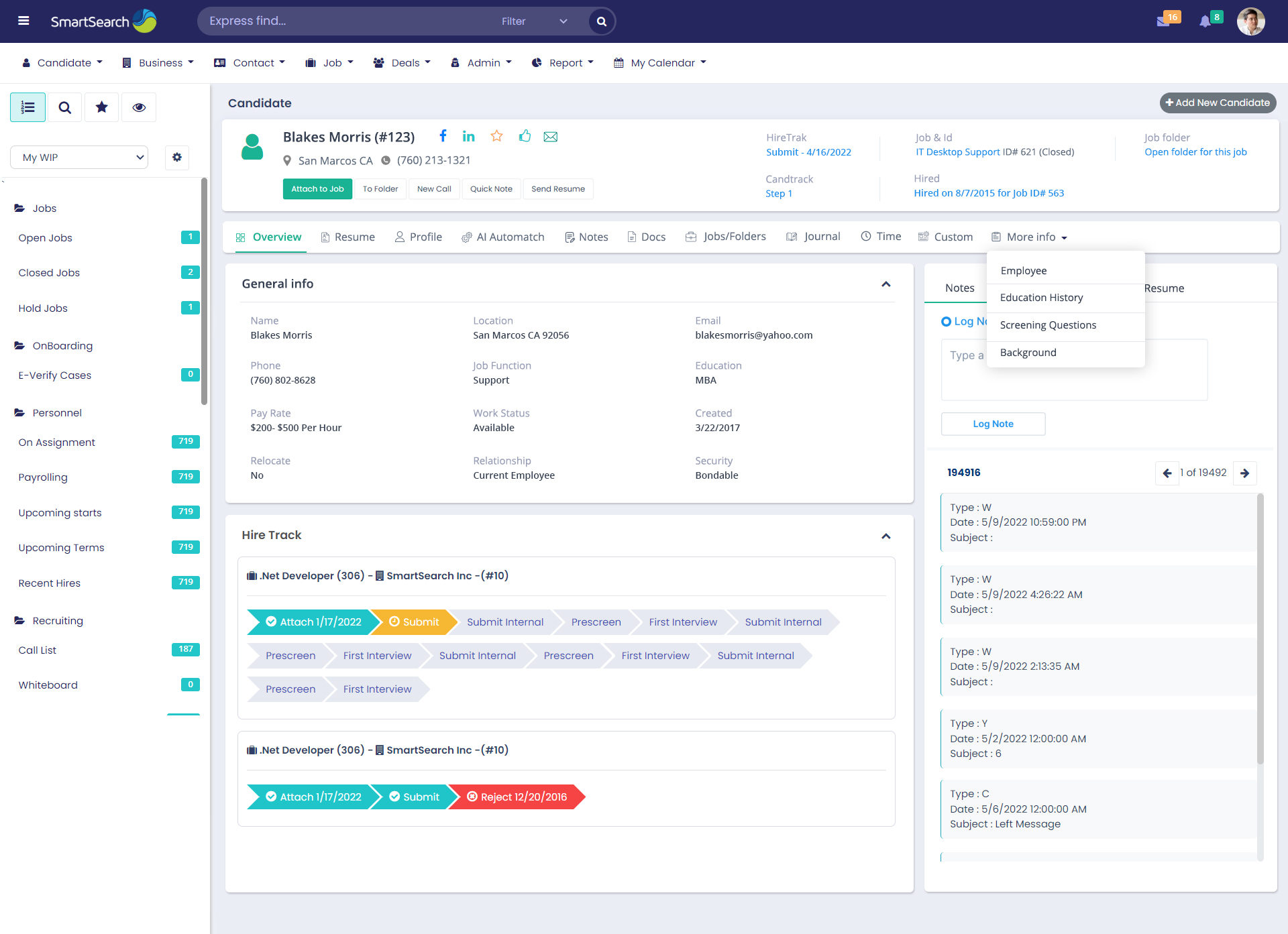
04.
Wireframes & Prototyping
Created wireframes to visualize key flows:
- Candidate Profile
- Job Listings & Attachments
- Onboarding Dashboard
- CRM Contact Management
- Search & Filter Module
Multiple variations were tested internally and iterated based on stakeholder and user feedback.
05.
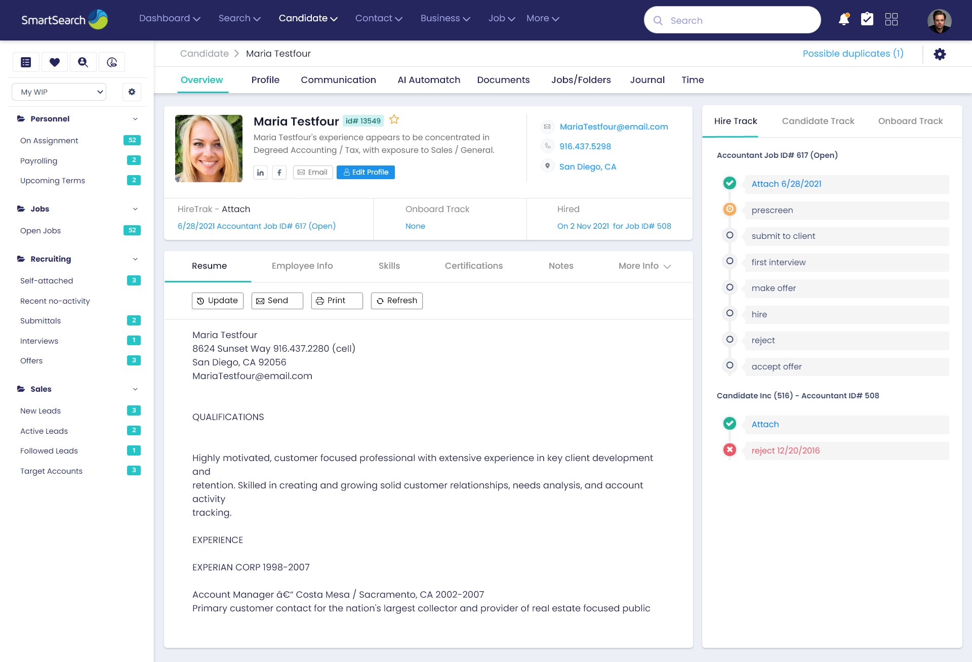
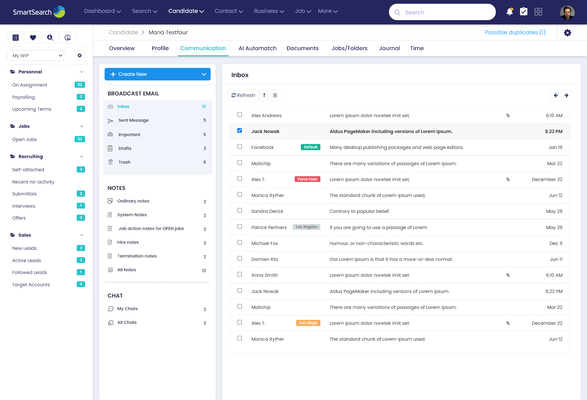
Visual Design & Design System
To maintain consistency and scalability, I built a component-based design system:
- Clean, modern UI aligned with enterprise standards
- Optimized spacing, typography, and color for readability
- Icon system and reusable patterns for faster dev handoff
- Used Figma for design collaboration and documentation
06.
Front-End Implementation
I collaborated with the dev team and handled:
- HTML/CSS structure, responsiveness, and cross-browser compatibility
- JavaScript components for interactive filters and dropdowns
- Bootstrap grid for layout consistency
- Design QA & support during sprint rollouts
07.
Challenges Solved
- Displaying large volumes of structured data in a meaningful way
- Making the experience usable across all screen sizes
- Enabling recruiters to take quick actions from any screen
- Reducing onboarding time for new users with simplified UX
08.
Impact & Results
- 25% faster candidate-job matching after redesign
- Improved recruiter productivity with streamlined workflows
- Mobile-ready system enabled flexible recruiting
- Created a scalable UI system adopted across modules
- Positive feedback from internal stakeholders and external clients
09.
Tools & Technologies Used
- Design: Figma, Photoshop, Illustrator
- Front-End: HTML5, CSS3, JavaScript, Bootstrap
- Process: Agile, Scrum, Daily Standups
10.
Learnings
- Importance of balancing data density and readability
- Continuous feedback loop with developers improves delivery
- Building a design system early saves time in scaling UX
Let's Create Something
Together
Get In Touch!